For those who might be reading this blog hoping for engaging stories of unusual places and interesting people, sorry, today is about motors.
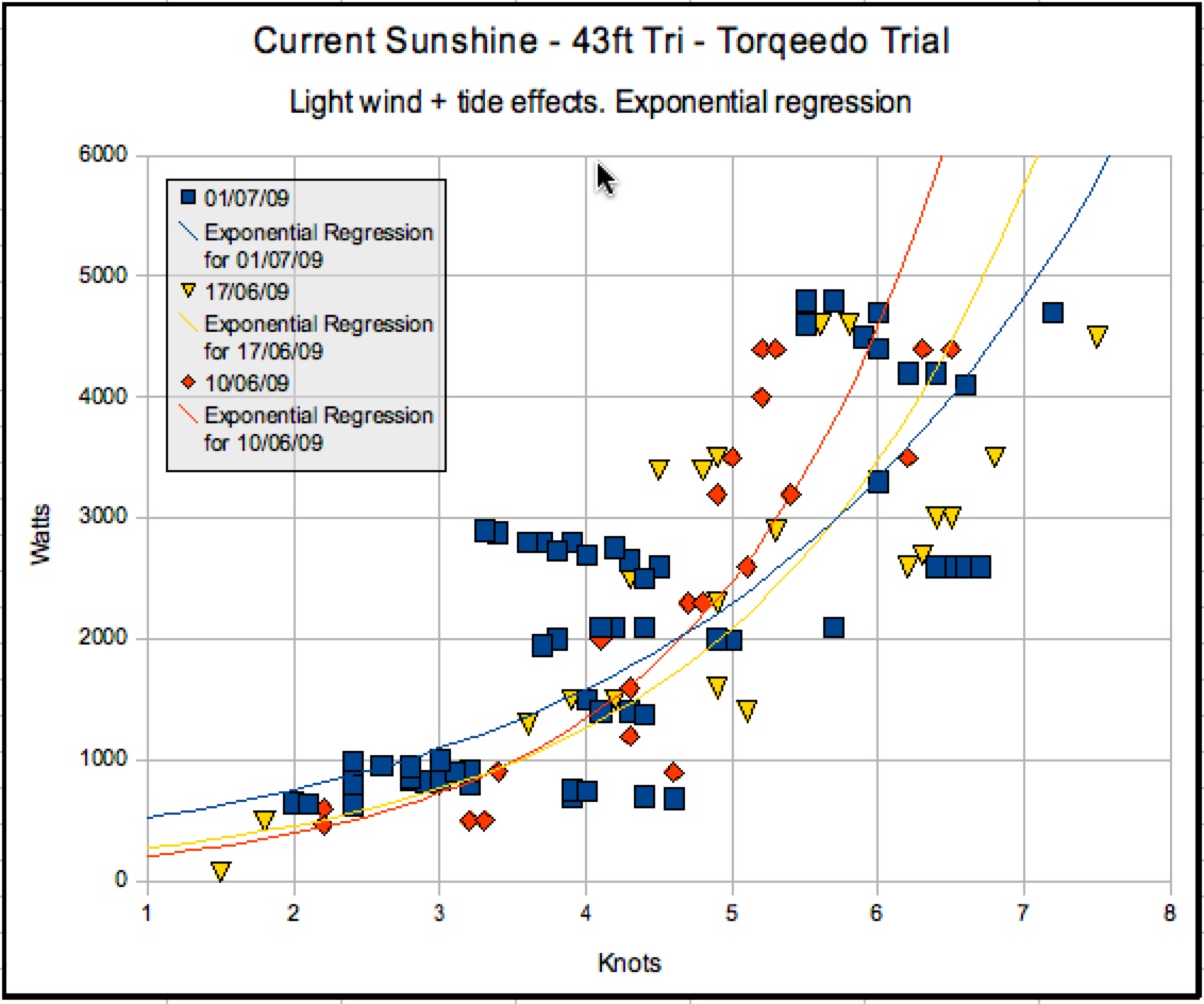
I’ve now figured out how to add more trials to the plot and show the three separate days on which tests were done with the Torqeedo. It definitely more colourful – But whether its useful remains to be seen:
The red series is the first day we tested the Torqeedo and there were 8 people on board, and the motor was jury rigged in position in the well. That might explain why both the other test days, (yellow and blue) show higher top speeds. But its odd that low speed the red line is the best – that is, not drawing much power to maintain the speed.
And I had hoped that the streamlining of the flaps would have helped make her faster at all speeds. But doesn’t seem so.
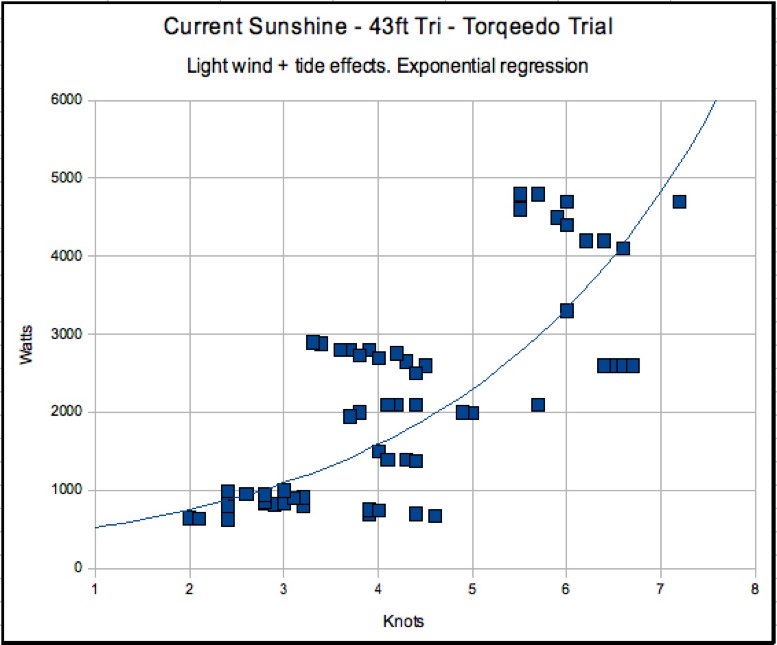
But I think this exponential regression plotting thingo is influenced by the number of observations. And so if going one way I was engaged in conversation and didn’t take many readings, and then coming back I was focussed and took many readings, well maybe that skews the graph towards the side where many readings are taken.
Its sure to get better as I collect more information and learn more about how to interpret it properly.


